UI/UX Design
Research-led UI/UX design that turns complex products into interfaces people actually understand — shipped as production-ready Figma systems.
The Problem We Solve
Most products aren't failing because of their features. They're failing because nobody can find them, the flows don't match how users actually think, and the interface was designed for the person who built it — not the person using it.
The usual symptoms: a clean homepage that funnels into broken onboarding, a dashboard with thirty widgets and no hierarchy, a mobile app that treats the phone like a shrunken desktop, a checkout that drops half the users on the last step. Every one of those is money left on the table.
Teams that try to fix design without research end up debating opinions in meetings. Teams that do research but don't ship design systems end up with a product that drifts visually every quarter. And teams that hire a freelancer for a one-off redesign get a beautiful Figma file that nobody on engineering can actually build.
The real cost isn't just conversion — it's trust. Users who struggle with your interface conclude your product is the problem, not their understanding of it. And once they decide that, no amount of marketing brings them back.
Our Approach
We design by evidence. Every interface decision is backed by user research, analytics, or an explicit hypothesis we'll test — not by what the loudest voice in the room thinks looks good.
We start with discovery: user interviews, usability tests on the existing product, analytics teardown, and a competitive audit. By the end of week one, we know the top three friction points quantitatively, not anecdotally.
Information architecture comes before visual design. We map the actual tasks users are trying to complete, strip the navigation down to what matters, and validate the structure in low-fidelity tests before a single pixel is polished. Skip this and you build the wrong thing beautifully.
Visual design is then a production-ready system, not a deck of screens. Figma components with variants, tokens for color/type/spacing, documented states, and dev-mode specs. Engineers open Figma and know exactly what to build. Designers extend the system without breaking consistency.
Accessibility and RTL are not afterthoughts. WCAG 2.1 AA contrast, keyboard flows, screen reader patterns, and native Arabic typography are designed in — not retrofitted. For bilingual products, we design the Arabic experience with the same care as the English one.
We stay engaged through development. Design review on PRs, motion specs, and handoff sessions with engineers mean the shipped product actually matches the design, not a 70% approximation of it.
What You'll Receive
Every deliverable, reviewed and ready to ship.
Research findings report
User interviews, usability test recordings, analytics insights, and a prioritized list of the friction points worth fixing.
Information architecture
Sitemap, task flows, and navigation model validated before visual design begins.
Production-ready Figma system
Tokens, components with variants, states, dev-mode specs, and usage documentation.
High-fidelity screens
Every priority screen designed in EN and AR, across desktop and mobile breakpoints.
Interactive prototypes
Clickable flows for key journeys — used in stakeholder reviews and usability testing.
Accessibility specs
WCAG 2.1 AA annotations, keyboard order, focus states, and screen reader patterns documented in Figma.
Design-to-dev handoff
Engineering walkthrough, motion specs, exported assets, and ongoing design review during implementation.
How We Work
A transparent process, every step of the way.
- 1
Discovery & research
User interviews, usability tests, analytics review, and competitive audit. We surface the real problems — not the ones in the brief.
- 2
Information architecture
Task flows, sitemaps, and navigation model validated in lo-fi before any visual design begins.
- 3
Wireframes & prototypes
Low-to-mid fidelity screens focused on structure. Tested with real users before we commit to a visual direction.
- 4
Visual design system
Production-ready Figma system with tokens, components, states, and EN/AR coverage across every priority screen.
- 5
Developer handoff
Dev-mode specs, motion specs, QA passes during implementation, and design review on every PR until launch.
Outcomes You Can Expect
Increase in task completion rate (typical)
Drop in support tickets after redesign
WCAG 2.1 AA compliance on core flows
Faster design velocity with system in place
Technologies We Use
Battle-tested tools from the projects we've shipped.
Projects We've Delivered
View all projects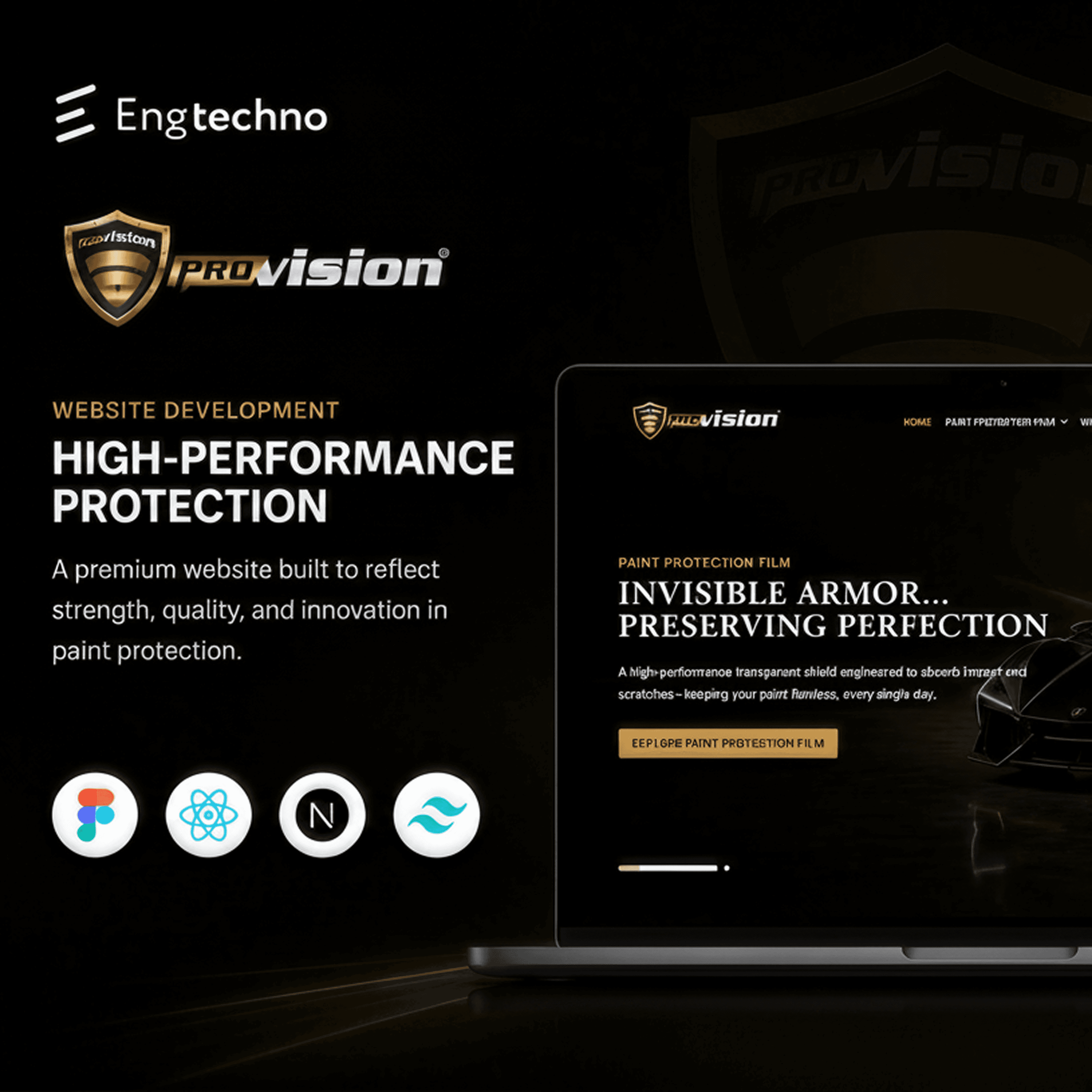
Provision
Automotive Protection

Tafra
Educational Platform

Qouponi
E-commerce
.png&w=3840&q=75)
Mental Health Clinic
HealthTech
Frequently Asked Questions
We start with discovery and user research, then move to information architecture, wireframing, visual design, and a production-ready design system in Figma. Every handover includes component specs, tokens, and interactive prototypes.
Ready to get started with UI/UX Design?
Tell us about your project. We'll come back with a plan.